1. One Clear Call-to-Action (CTA)
Don’t confuse visitors with too many buttons. Use one to two main CTAs per page to guide users to action. Ideally, this CTA should directly reflect your business goal, like scheduling a consultation or purchasing a product.
- Place the CTA above the fold and again near the bottom
- Use high-contrast colors so the button stands out
- Keep the text short and action orients (eg. "Book a Free Call)
2. Action-Packed Buttons
Generic buttons like "Submit" or "Click Here" don't inspire action. Instead, use buttons that reflect the value the visitor will get by clicking.
- Use verbs that align with what the user wants, like "Start My Project" or "Get a Free Quote"
- Test button wording to see what drives more clicks (A/B testing)
- Ensure buttons are readable and accessible on all screen sizes
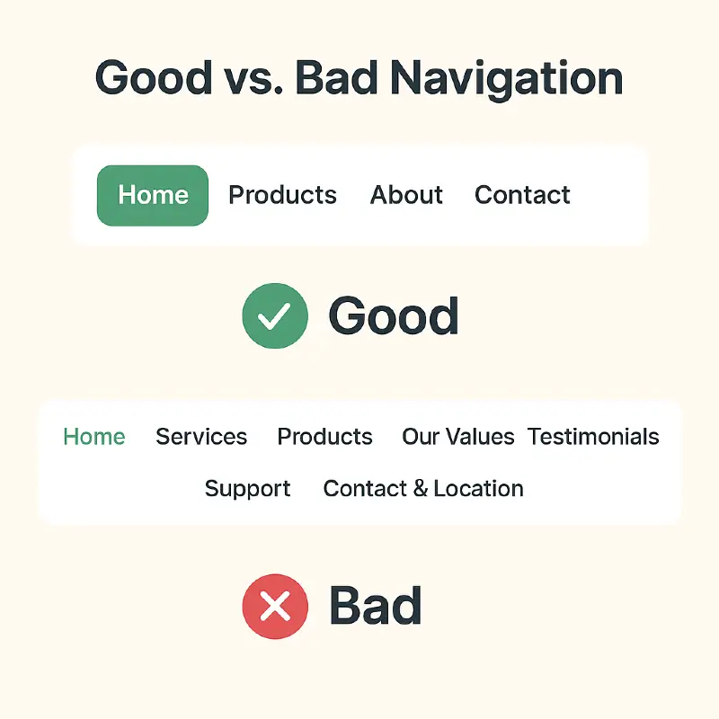
3. Simplified Navigation
Visitors shouldn't have to guess where to go next. A simple, clear navigation bar keeps users oriented and reduces bounce rates. Avoid overly complex dropdowns and technical jargon.
- Stick to 5-7 main menu items to avoid overwhelming visitors
- Use familiar lavels like "About", "Services", or "Contact"
- Ensure the menu is responsive and easy to tap on mobile devices
4. Testimonials Where It Counts
People trust people. Featuring a real testimonial near your call to action or within your homepage helps build instant credibility and reduces hesitation
- Use real names and photos if possible to enhance authenticity
- Highlight a testimonial near you hero section or headline to build trust fast
- Rotate or highlight multiple short testimonials in a slider
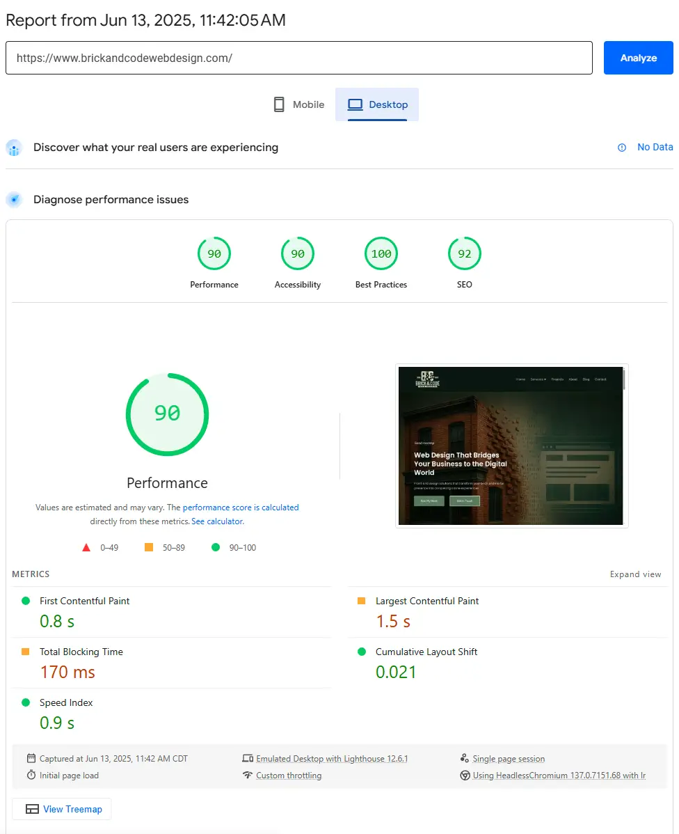
5. Page Speed Wins
Your site's speed directly affects conversions. Even a 1-second delay can drop conversions by up to 7%. Visitors will leave if your site takes too long to load, especially on mobile.
- Use compressed image formats like WebP to keep pages lightweight
- Limit how many fonts, animations, or third-party scripts you load
- Talk to your web designer or host about enabling speed-boosting tools like caching or CDN services
6. Shorter Forms
Long, complicated forms can scare visitors away. Focus on the essentials: just enough information to follow up. The fewer fields, the more likely somone will reach out.
- Ask only for what you truly need, usually: name, email, and a short message
- Consider a short message box instead of multiple dropdowns or checklists
- Let your web designer style it clearly and mobile friendly
7. Design for Mobile First
Most visitors view your website on a phone. If it's hard to use on mobile, you lose leads. Mobile first design keeps your site fast, readable, and easy to interact with.
- Use large text and clear buttons that are easy to tap
- Stack content in a clean vertical layout for small screens
- Ask your web designer to test on both iPhone and Android devices
8. Strong, Clear Headlines
Your headline is the first thing people read. It should make it instantly clear who you help and what you do—no cleverness required.
- Use clear benefit driven language (e.g. "Web Design for Local Businesses")
- Place the headline at the top of your homepage or landing Page
- Avoid vague or trendy phrases like "We build experiences", be direct

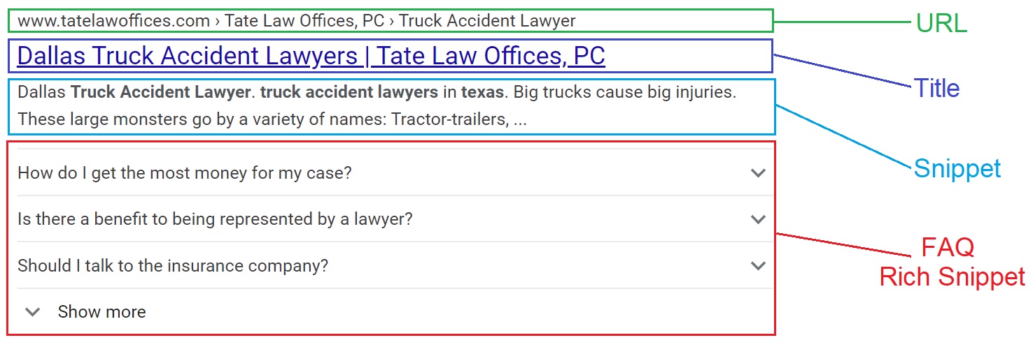
9. Add an FAQ
Answering common questions upfront saves everyone time and can even improve your visibility on Google with special FAQ listings (called rich results).
- List 3-5 frequent questions you hear from customers
- Write short, honest answers that clear up confusion
- Ask your web designer to add Schema markup to help them show up in search